Clarendon:
Magazine Spread
To explore typesetting, we are to create a two-page spread that introduces the reader to our selected typeface. My typeface is Clarendon.
PRINT DESIGN / TYPOGRAPHY / LAYOUT DESIGN


RESEARCH
Characteristics
-
Thick, bracketed serifs—ease of readability and visibility, as well as softer and more approachable feel
-
Upturned foot on "R"
-
Ball terminals
-
Short ascenders and descenders
-
Five weights—light, roman, heavy, bold, black
History/Context
-
Created in 1845 by Robert Besley
-
First typeface to be patented
-
Designed as a "related bold" —a typeface to harmonize and align with other roman types
-
"WANTED" posters of the American Old West
-
Posters printed on wood type
CONCEPT
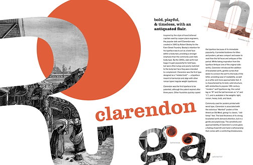
Clarendon’s association with nature (wood type, national park signage) gives the typeface a feeling of warmth and hand-craftsmanship that comes with a comforting timelessness. Its’ thick square serifs are bold, confident, and sturdy, yet the soft curves of the brackets are gentle, approachable, and charming. Therefore, for my spread, I wanted to communicate the playfulness and timelessness of Clarendon.
THUMBNAILS
Because the letterforms of Clarendon are so unique and elegant, I focused a lot of my initial thumbnails on how I could create dynamic and informative imagery by highlighting the different quirks of each letter.


TYPESETTING
Using Clarendon's letterforms to inform and guide the spread's proportions.

EXPLORATION
I primarily explored between two compositions—the "big R," and the scattered letterforms. I played around with tilting letters, masking images, and bleeding across the spread and through the margins to add even more energy to the composition.

FOCUSING ON A COMPOSITION
I liked the direction this "big R" composition was going—the tilted letters are playful and bold, and the orange spot color speaks to the Wild West narrative. The image punch out is a vintage etching of an Old West market in Washington Square. However, I felt that there was an area of dead space in the center of the spread, between the “R” and body text, and above “Clarendon.”

MORE & MORE ITERATIONS
Playing around with the use of color and image, and trying to activate the dead center space.

REFINEMENT
Making final alignment edits in InDesign. I played around more with the orange circle motif, and swapped in the letter “n” for the upper right corner.